Most Misleading Video Game Covers Ever
Back in the days before YouTube playthroughs and trial downloads, every video game was just an expensive mystery wrapped in an attractive cover. Unless you had a rich neighbor or a foldout map in Nintendo Power to give you a preview of the newest titles, aspiring gamers had nothing to base how good a potential buy could be other than a couple of tiny screenshots, some box art, and a prayer to the digital gods. Even then, there was still a high likelihood that you'd return home with an incredibly disappointing hunk of plastic. Here are some video games that had the most deceptive box art of all time.
Odama (2006)
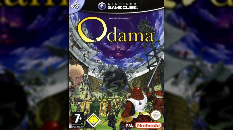
At first glance, Odama seems like it's about warring villages in feudal Japan, which could really fit into many different game genres, from real-time strategy to fighting—even racing if you tweak history hard enough. What you'd never suspect is that Odama is actually a pinball game. Yes, the cover depicts an enormous boulder crashing through a castle wall, but it leaves out any elements which might further suggest the pinball theme. Who's noticing anything else anyhow aside from that giant, pink head off on the left? Odama was a missed opportunity to snag the extremely dedicated pinball crowd.
Metal Gear Solid 2: Sons of Liberty (2001)
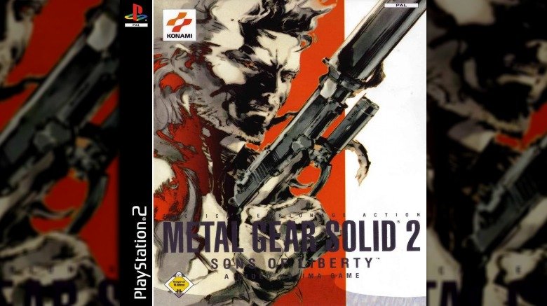
Metal Gear Solid 2: Sons of Liberty is arguably one of the finest stealth games of all time and helped propel the young PS2 into legendary status among consoles. And, at first glance, the cover isn't anything particularly out of the ordinary — like many of the other games in the series, it takes on something of an anime-style in its depiction of the protagonist, Solid Snake, harking back to the saga's Japanese roots.
So far, so Metal Gear. What people weren't expecting, however, was to find themselves at the mercy of gaming history's most audacious bait-and-switch. Despite a marketing campaign filled with trailers, screenshots and even a demo in which Snake was portrayed as the game's protagonist, players entered the game's main act only to find that Snake wasn't the lead character after all — it was an entirely new, utterly different character named Raiden. Hideo Kojima had lied. The trailers had lied. And the cover, displaying Metal Gear's poster boy and beloved hero in all his killer glory, had most certainly lied. People took it about as well as you'd expect.
The Orange Box (2007)
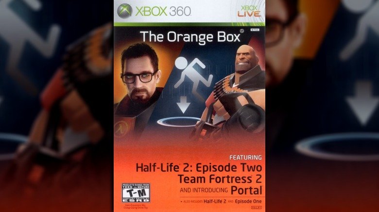
As far as good games wrapped in boring covers go, The Orange Box is the all-time champ. If you're not already knowledgeable about modern games, you'd have no way of knowing that the compilation actually contains some of the most popular and successful hits ever released. Instead, the game's cover depicts a nerd, a berserk garbageman, and instructions about how to avoid tragic bathroom accidents. It's like a Greatest Hits album from a band you've never heard of that just smashes a bunch of disparate images from different albums on the cover, and you have no idea where to turn first. Fortunately, most gamers were able to see past this bizarre cover and enjoy the amazing hits trapped inside.
Dragon's Lair (1990)
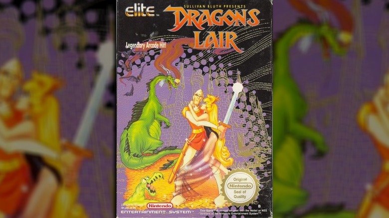
The legendary Dragon's Lair arcade cabinet gave players a unique, animated gaming experience backed by LaserDisc, mastered only by those with lightning-fast reflexes and a wicked memory. By all accounts, Dragon's Lair was the darling of the arcade scene in 1983 and for many years beyond. When the Nintendo Entertainment System version came out in 1990, using the same cover art as the beautiful arcade version, one would naturally expect a similar experience. Unfortunately, the port of the game was abysmal, with absolutely none of the animated sequences or gameplay that made the original great. Instead, console gamers had no warning that they were getting a pathetic sidescroller that couldn't even touch an Intellivision game on its worst day.
Pirates of the Caribbean (2003)
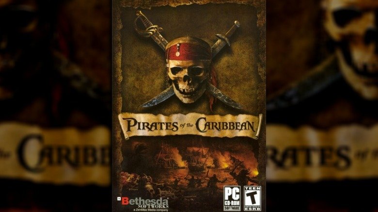
Back in 2003, Bethesda released a PC tie-in to one of the year's most popular films, Pirates of the Caribbean. The cover was basically what you'd expect from a Pirates game — the movie's logo and title splayed over an image of pirates raiding and pillaging which could easily have come from the DVD cover. That, however, is where Bethesda's great lie can be found.
You see, Pirates of the Caribbean wasn't really a Pirates of the Caribbean game. It was actually a sequel to the 2000 RPG Sea Dogs, repackaged and repurposed as a tie-in to boost sales. Save for a brief appearance by a ship called the Black Pearl, there was nothing within the game (which took place about a century before the movie) to actually connect it with its silver screen sibling.
EVE Online (2003)
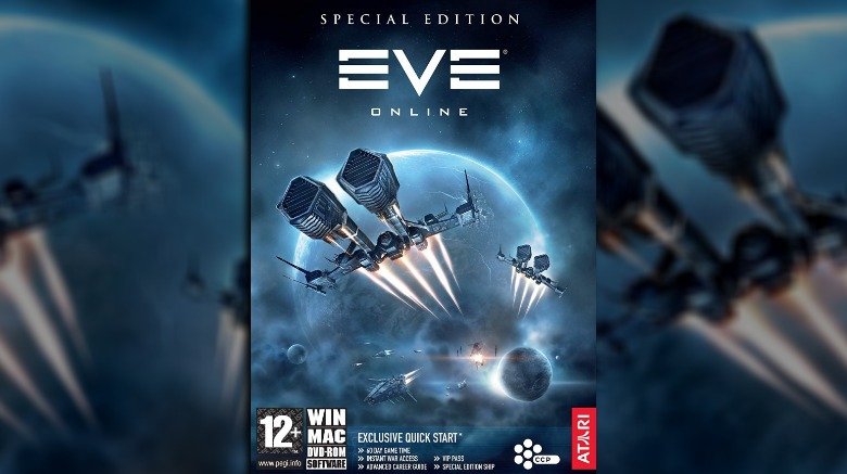
Yes! Check out that beauty. Spaceships warping away from a planet, out on some intrepid adventure through the depths of space. Exciting, right? You probably can't wait to dive into EVE Online for a bit of thrilling space combat action. Well, you might want to slow down there because EVE is going to give you nothing of the sort.
To its credit, EVE Online has been responsible for some of the most mind-bogglingly dramatic stories to come out of gaming in the last few decades, but that doesn't change the fact that the game itself is almost terminally dull. Plodding in its pace, unremarkable in its graphics, and suffering from what one player admitted was a six-month wait until new players get to have any fun, EVE is anything but exciting. Don't believe the stories, and definitely don't believe the cover.
Final Fantasy XV (2016)
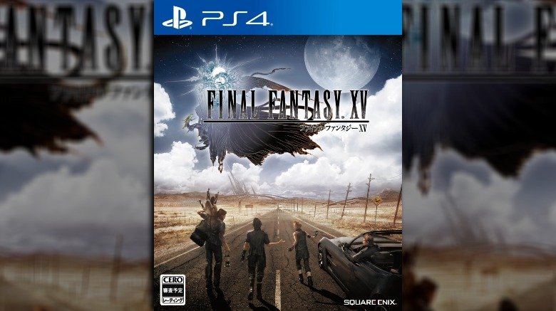
This version of Final Fantasy XV's cover, to someone who doesn't really know what Final Fantasy is, appears to be depicting a game in which a gang of teenagers travel across the Australian outback, learning all about life and love along the way. It's a little bit like a John Hughes movie, just with the tantalizing promise of sci-fi sitting on the literal horizon.
You certainly wouldn't be ready for the sprawling symphony of bizarre chaos that a Final Fantasy game can be. Perhaps the biggest lie about this cover, though, is that it just makes the game look not very good, when, according to the reviews, it's actually quite enjoyable. Also, the car can fly. Who'd have thunk it?
Amnesia: The Dark Descent (2010)
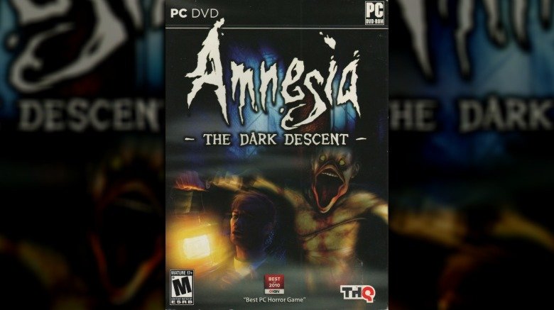
Take a quick glance at the original U.S. cover to Amnesia: The Dark Descent and we wouldn't blame you for thinking it's a comedy game. Seriously, look at that mess: a man (who looks disarmingly like a very confused, blond Jason Bateman) holds up a lantern as a who-knows-what (which looks like someone injected Donald Duck with the rage virus from 28 Days Later) leaps out at him, as the both of them, judging by the motion blur, travel across the room at 60 miles per hour. It's not exactly terrifying.
Amnesia itself, however, is terrifying. In fact, it's so utterly, downright, fist-in-mouth unpleasant that Eurogamer made a case for it being one of the most influential horror games of the decade. Amnesia is a game that many people within their right mind are actually incapable of playing for more than 10 minutes. The game this cover was made for is one many people within their right mind would laugh out of the room.
Uninvited (1991)
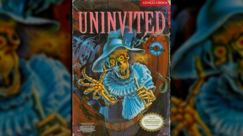
Nintendo kids had Castlevania and Monster Party on the brain by the time 1991 came around. They were eager to play any game with a scary monster on the cover. Uninvited delivered, with a creepy, skeletal zombie on its box art. What's not immediately obvious amid the excitement of seeing a dead creeper on a video game cover is the fact that the zombie is wearing a pretty lady's dress and not a wizard's robe. Surprisingly, Uninvited is a point-and-click adventure title that doesn't involve any whips or fighting demons. It's actually a pretty good MacVenture game, alongside Shadowgate and Deja Vu, but certainly not what any action-oriented gamer would have expected.
Onechanbara Z - Kagura (2013)
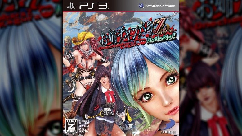
Here's a question for you — is a game's cover technically "misleading" when you have no idea what's going on in the first place? Let's try and figure out Onechanbara Z: Kagura with No No No! together, shall we? So there are, uh, girls. They're not wearing a lot. One of them either has a giant head or is much closer than the others. Demons seem to be involved, some of which can fly. Other than that? It's a crapshoot.
In fact, it's actually a hack-and-slash game in which you've got to cut your way through legions of undead abominations, stopping only to clean the blood from your sword and occasionally go into a "blood frenzy." It's actually a startlingly gory game, but you wouldn't know it, would you? It's probably fair to say that the only thing the cover correctly indicates about it is the fact that the girls aren't going to be wearing very many clothes.
Phalanx (1992)
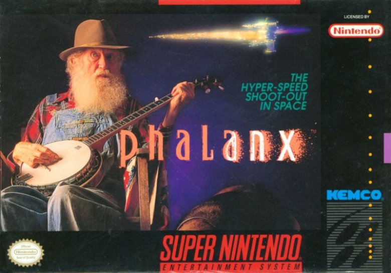
Despite what the cover of Phalanx might imply, it is in no way about an elderly hillbilly playing banjo songs about outer space battles, even though that would be an incredible premise. One day, someone will make that very game, call it Grandpa Banjo's Tenth Dimension Tales or something of that sort, and the circle will be complete. For now, Phalanx remains a fairly standard side-scrolling space shooter. The game's developers intentionally chose a nonsensical photo for its cover in order to separate themselves from the countless other titles in the genre that look and play almost exactly the same. Ultimately, this bizarre box art ended up driving potential buyers away.
Home Improvement: Power Tool Pursuit (1994)
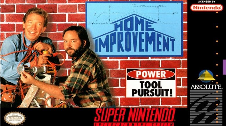
Most of us can agree that unless Tim Allen is playing Buzz Lightyear, we don't care about what he's doing, so whoever decided to use a generic Home Improvement stock photo on the cover of its tie-in video game wasn't really trying. Someone at Absolute Entertainment actually thought that kids would see a picture of Tim Allen and get excited. It's staggering that this was a real thought in someone's head. It turns out that Power Tool Pursuit involves Tim Taylor fighting dinosaurs and giant scorpions with a nail gun, which is truly amazing and feels a bit like a LucasArts game. The fact that a fun game was wrapped with Tim Allen's boring mug is a historic tragedy.
Spot: The Video Game (1990)
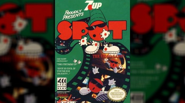
When your grandma sees one too many news reports about video games causing violence, you get Spot for Christmas, because the old 7 Up mascot couldn't possibly hurt anyone. When you see Spot adventuring on the game's cover, you retain some sense of hope. Unfortunately, Spot is nothing but a ripoff of the board game, Othello. Spot only took six weeks to program, and it shows everywhere throughout it—just not on its box art.
Ballz (1994)
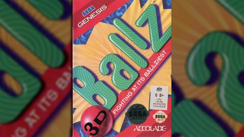
The cover of Ballz tells us nothing, except that it includes "Fighting At Its Ballziest," which isn't even a real word. Fighting, however, was an incredibly hot Super Nintendo genre, with Street Fighter II and Killer Instinct in heavy rotation, so Accolade ran with it. From the weird, erotic theme music to the near total lack of 3D graphics, Ballz is only barely a game, let alone a fighting game. Each fighter is composed of a series of colored spheres, and they fight on a slightly 3D plane, but that's about it. It's not so much that the cover is misleading, because it leads nowhere, but it's the fact that someone would wrap a game cover around a pile of vomit that's truly ballsy.
Adventure (1979)
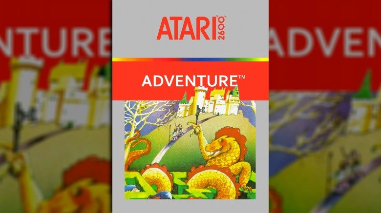
Adventure is the very first action-adventure console game. It also contains gaming's first hidden Easter egg, so there are some very good reasons to remember it, but the harsh truth of Adventure is that it's only a step above Pong in terms of visual complexity. Adventure's box art depicts an amazing, psychedelic dragon twisting through a hedge maze while dwarven adventurers approach from a castle in the background. Within the actual game, your hero is a giant square pixel, stuck in a maze of bland nothingness, running from dragons that look like pregnant seahorses. Charming, sure, but that box was a dirty liar.
NASCAR '14 (2014)
So much promise here. NASCAR '14 seems to take place in a post-apocalyptic future in which the Sun has been blotted out and all the skies have turned to darkness. Orange-red fumes linger in the choking skies, and through the smoke and the devastation only the shining light of NASCAR beams out hope to all humanity. A man, sponsored by Mobil and Bass Pro Shops, presumably prepares to entertain the last survivors of mankind as they await the very end. Talk about gravitas.
Take a look at any screenshots from the game, however, and you'll see cars driving around in a circle under blue skies on sunny days, featuring none of the intricate storytelling and melancholic atmosphere the cover promised. Then again, if you were put in charge of sprucing up a sport so utterly dull that people won't even watch it in real life anymore, never mind playing it on their consoles at home, you'd probably take a few liberties, too.
Holy Avatar vs Maidens of the Dead (2014)
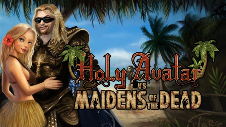
Confused already? You're not alone. Is it a Duke Nukem-style action comedy game? Is it some weird fantasy sequel to Leisure Suit Larry, starring Arthas from Warcraft III? Why are they on a beach? Why is that a zombie in the background? Honestly, kudos to the publishers for okaying a cover that so unflinchingly poses more questions about the game than it answers.
What you probably weren't expecting was a slow-moving, top-down, turn-based RPG. The plot, which follows a self-involved hero fighting zombies on an island to rescue a number of beautiful women, isn't actually much of a shock based on the cover, but most people probably didn't expect this to be a sub-par Final Fantasy ripoff. Well, maybe people got the sub-par bit.
Mahjong: Halloween Stories (2015)
Now, this is what appears to be a sub-par Final Fantasy rip-off. A kindly sorcerer holds his pumpkin stick aloft before a great castle while his cutesy mouse-thing sidekick perches on his shoulder and a frog looks on. You can almost smell the healing potions, can't you? Well, buckle up and brace yourself for disappointment, because Mahjong: Halloween Stories is nothing more than a digital mahjong simulator with a few tenuous level-up bonuses and a vague, uninteresting non-plot.
Mahjong, in case you didn't know, is an ancient Chinese tile game similar to what the West knows as rummy. Although it's a game of great skill and strategic thinking, at no point during play does anyone utilize a mouse sidekick or a pumpkin stick. And if you disliked that, you don't even want to think about Mahjong Wolf's Stories.
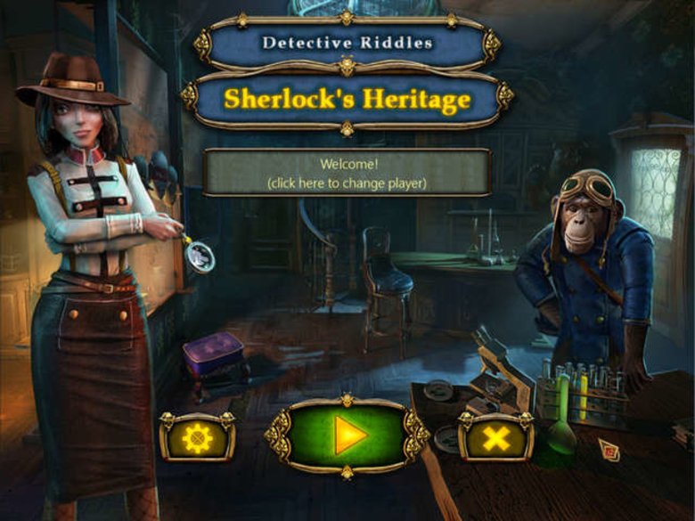
Detective Riddles: Sherlock's Heritage (2015)
No, your eyes do not deceive you. That is, indeed, a gender-swapped Sherlock Holmes inspecting a chemistry laboratory with her monkey pilot companion. From the cover alone, which features the same art as the screenshot above, Detective Riddles: Sherlock's Heritage promises to be perhaps the greatest artistic creation mankind has ever produced, and certainly the best game ever.
Spoiler alert: It's not. Detective Riddles is actually a "griddler" game, something which appears to be a terminally boring kind of brain teaser, presumably invented when someone crossbred sudoku with Tetris after taking the fun out of both. Detective Riddles promises "120 unique levels," a "simple tutorial," and the chance to "earn the respect of Sherlock himself." So not only is Sherlock not gender-swapped, but the monkey butler appears to be nothing but the perpetrator of an elaborate cover art scam. 0/10.
